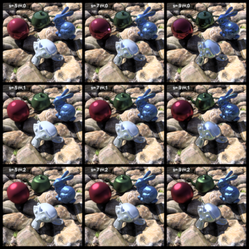
Hey all! I just wanted to share that I’ve done a series of renders to demonstrate different values of specularity and roughness. It’s similar to Rob’s examples in the Siggraph 98 PDF, except I’ve recreated it with some other objects
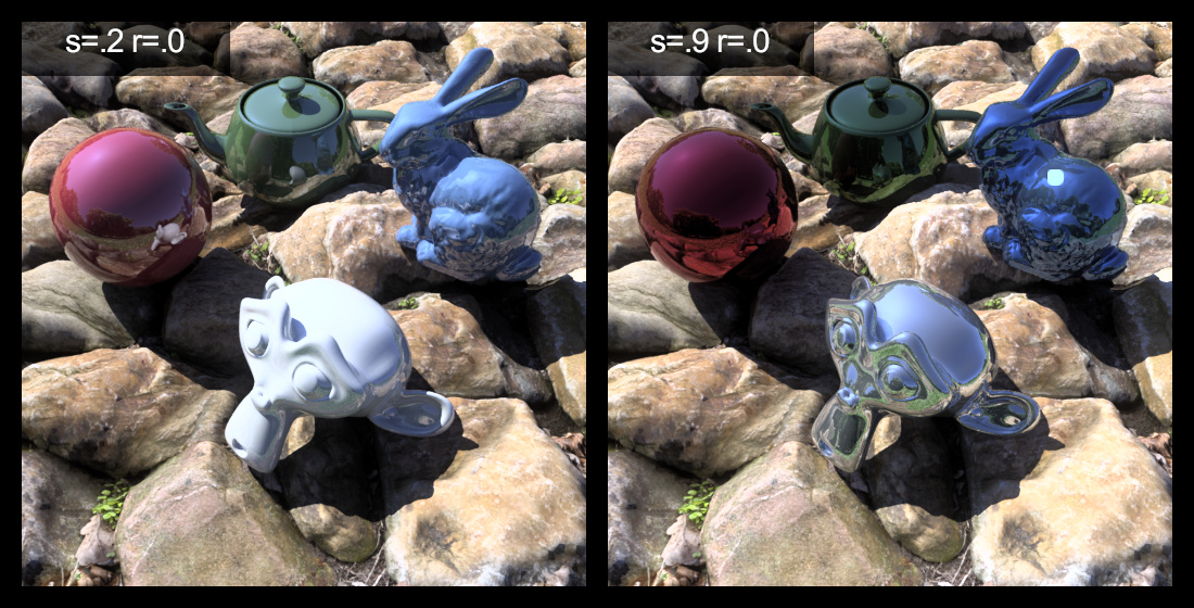
Here is an example comparing plastic and metallic:
You can see all the rest of the charts (for plastic values and metallic values) at the link below. I hope you find it useful! I’m not attaching it here because the high resolution files are quite large in filesize:
I’ve found that looking at these help give me an intuitive understanding of exactly what different values of specularity and roughness represent, and help me “guestimate” those of real life objects a bit better.
I would also appreciate any feedback if I have any wrong explanations in that webpage about my understanding of specularity and roughness.
Thanks @Greg_Ward ! I’ve recreated the images for plastic with a range of .0-.1, and metal with a range of .8 and up. Hopefully that makes things look bit more realistic. Just refresh the article website and you should see the updated images. I’ve also updated the rules of thumb to say:
Most plastic (i.e. non-metallic) surfaces have a specularity of .0 to .1
Metallic surfaces generally have a specularity from .8 to .99, but are usually .9 or greater
Both plastic and metallic surfaces rarely exceed a roughness of .2
It would be good if somebody with a spectrometer could measure the specularity and roughness of everyday objects to give more examples. For example, a plastic bag, a piece of paper, a galvanised steel bracket, roof sheeting, and so on. I recall there was a website which held samples of Radiance materials that used to exist at http://www.lighting-materials.com/, but the website seems down now.
Any more suggestions on improving the article are much appreciated!
Jim Ferwerda has done a fair amount of work on material comparisons. Check out this link to one of his presentations based on a paper of the same name.
Fascinating presentation! I didn’t read the paywalled paper, and I’m not qualified to completely understand his presentation but this is what I got out of it:
Largely we perceive gloss based on the constrast of reflection (contrast gloss) and distinction of reflected image (DOI gloss)
There are certain physical parameters in the Ward model that create a perceptually equivalent result, despite actually having different physical values.
There is a huge bias in grouping by uh, I’d like to say colour, but I figure it’s more the darkness of the colour.
I’d say the charts I’ve created largely agree with these findings. For example, I would say that the green teapot in s=.075 r=.05 is the same perceptually as the red ball in s=.025 r=.1.