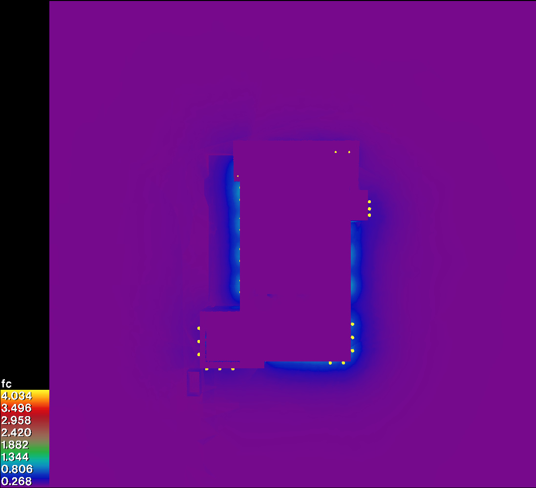
I recently created an illumination plan of a building and its exterior mounted lights (300lm) as shown below. I did this by doing an illuminance render, and then visualising it with falsecolor -i. I also used the multiplier -m 16.629505759940542 to convert from Lux to foot-candles. That multiplier was obtained by dividing the default multiplier by the Lux->Fc conversion (179/10.764).
A couple questions:
- Is my multiplier correct? My lamp brightnesses are derived from
lampcolor. My model scale is in meters.
- I only know how to visualise it in two ways - a falsecolour as shown below, or isolux contours. However the disadvantage is that both, when printed in black and white, cannot be read. Is there a way to generate, say a grid of numbers over the image? Or something else entirely?
Thanks very much 
Your conversion factor looks correct to me.
As for black & white output, falsecolor is not much use. Unfortunately, we don’t have a tool that puts out nicely labeled contours, which is actually one of the more challenging problems in scientific visualization… You can of course create your own grid of illuminance values, but I don’t think we have anything tailored to that in Radiance proper.
Maybe someone can offer up their preferred script or method for that?
Thank you @Greg_Ward! For creating a grid, I see two approaches:
- I first generate a coordinate grid of points, and I ask Radiance to calculate the results only at those specific points and not in between. The results are then visualised. This seems like a more efficient approach as less calculations are done.
- Radiance calculate everything as shown above, and then I parse the
.hdr output to visualise it as a grid of numbers? The numbers would then either be exact values in the .hdr file with a multiplier applied to the correct unit? This seems like the “easier” approach to hack together, as I can simply use Radiance to carve up the resultant .hdr file into many 100x100px images, and then use Radiance to report back the average brightness of each one, which I then multiply, and then I use imagemagick to generate a visualisation of these numbers in the 100x100px images, and stitch the back together.
Which approach sounds sensible? I can imagine how to do the latter, but the former I’ve no idea how to begin.
If this is a one-off, you can run ximage on a rendering produced with the -i+ option, and manually select points or areas and hit the ‘l’ key to print the illuminance (in lux). If you need footcandles, you can pass the image first through “pcomb -o -s 0.09294 orig.hdr > fc.hdr” to force a change in the scaling factor.
Alternatively, the following command will average 100x100 block areas in a “-i+” irradiance image and convert to fc:
pfilt -1 -x /100 -y /100 orig.hdr | pvalue -h -H -o -b | rcalc -e ‘$1=179/10.76*$1’
The values will be left-to-right, top-to-bottom order, and you can use imagemagick as you suggest or go the more laborious route with pcompos and a bunch of psign calls.
The first option you mentioned also works, using “rtrace -I+” and passing it the desired illuminance point positions and orientations:
rtrace -h -I+ [options] octree < input_pts.txt | rcalc -e ‘$1=179/10.76*(.265*$1+.670*$2+.065*$3)’
Hi Dion,
there is quite a lot of tools available to visualize gridded data. I am
frequently using gnuplot. Gnuplot understands x,y,z (with z
corresponding to illuminance E_h in your case). Just make sure that you
add an empty line before starting the next row of values. So something like
x1 y1 E
x2 y1 E
…
x512 y1 E
x1 y2 E
…
That allows you to use splot (surface plot, e.g.
http://lowrank.net/gnuplot/plotpm3d2-e.html). You can then apply
falsecolor scales, add contour lines, and introduce interpolation in
case you want a “smooth” appearance. In fact I usually prefer a larger
grid visualized by squares. You may also consider a logscale to account
for the rather steep gradient - or, not as nice but more comprehensive,
combine two linear plots with different ranges.
When I generate plots for reports or publications, I am relying on the
pgfplots package in Latex these days, which offers everything (and a bit
more) that gnuplot does. But that makes sense only if you aim at
embedding the results in a document.
There are many other tools around, and there is a lot of open source
software for scientific data visualization. Gnuplot has the advantage
that (although it appears cryptic in the beginning) you can achieve a
lot with few lines, and that you can reuse these with other datasets.
Cheers, Lars.
Thanks @Greg_Ward and @Lars_Grobe! I had to change the latter $1 in the rcalc command to be $3 to work. Your tip about pcomb and the l key is a great way to quickly check average illuminances!
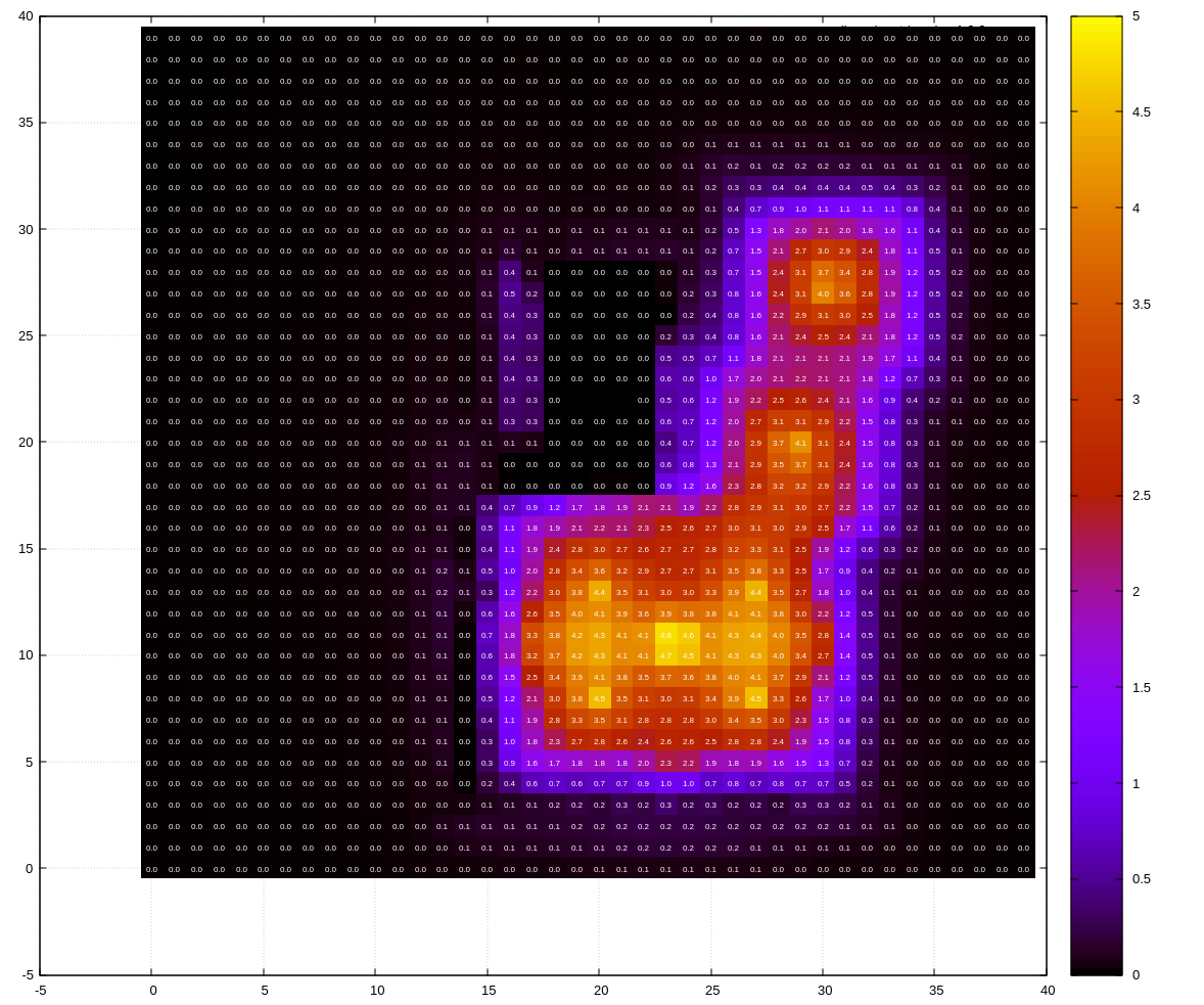
I’ve combined both the pfilt method as gnuplot as follows to create a 15 by 15 px heatmap. This results in 40 rows for a 600px foo.hdr input file. Hence there are 40 dashes in the paste command. gnuplot looks incredibly full of potential and I will need to dig further into how to use it in the future!
$ pfilt -1 -x /15 -y /15 foo.hdr | pvalue -h -H -o -b | rcalc -e '$1=179/10.76*$3' > data
$ paste - - - - - - - - - - - - - - - - - - - - - - - - - - - - - - - - - - - - - - - - -d' ' < data > data-matrix-flipped
$ tac data-matrix-flipped > data-matrix
$ gnuplot
> plot 'data-matrix' matrix using 1:2:3 with image, \
> 'data-matrix' matrix using 1:2:($3 == 0 ? "" : sprintf("%2.1f",$3) ) with labels textcolor 'white' font ', 5'
This gives a result like so. (Edit: note that this image is a different simulation than the one in my first post, so they look different )
1 Like
Oh, whoops. I meant to include the “-d” option to pvalue. Your solution works fine, though. I like your result.
1 Like
Looks like you got something working, but also could consider if there’s any 3D modeling environment you’re invested in such as Rhino/Grasshopper or Sketchup where there might be a corresponding data visualization plugin for it. Or Paraview for origin-agnostic 3D data visualization - but you do have to organize the data with a header according to the file format.