I’m trying to calibrate several different monitors such that images rendered on them will match the color of a physical sample under room lighting. As I understand it, this requires that I correct the coloring of the image differently for each monitor, based on the inherent differences between monitors from different manufacturers. I have a physical Macbeth chart and a rendering of one, and the color of the physical chart and the rendering on each monitor is different (see the 7 teal squares below under 3000K lighting).
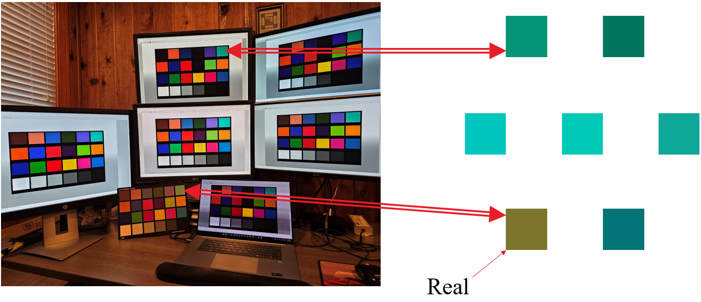
I know that given a photograph, p, showing both the physical chart and a screen with the rendered chart, I can use macbethcal to select one of the charts and produce a calibrated image, p’. I could then repeat this process on p’ selecting the other chart to produce an image p’’ representing the transform from the color space of the first Macbeth chart to that of the second. However, applying multiple color corrections seems to degrade the image quality, so I’d like to do this in a single pass, preferably without knowledge of the room lighting.
Is there a way to use macbethcal where I can input the primaries of one a color chart instead of using the hardcoded values so that I can shift the rendering to match the appearance of the physical chart next to it under arbitrary real-world lighting? Or is there an alternative approach to this?